Chapter 12. Usability Reports
![]()
A document prepared after a usability test, capturing the findings and observations and, potentially, recommendations.
After conducting a usability test, the design team will have a pile of data. This information provides useful direction for design activities, but the team’s ability to respond to the results hinges on how the results are presented.
Usability results are usually presented as a report. In our industry we are resigned to expect a fat report coming out of usability testing. Experience shows that design teams don’t need big reports, which generally include information not essential to the design effort.
This chapter positions usability results as a design tool, minimizing the extraneous stuff and focusing on how designers can use them as a valuable input into their process.
Different design teams have different conceptions of usability testing outputs. Some teams ask their usability person to perform tests and report on what the users thought. Others want to see design recommendations based on the observations. This chapter assumes that there’s a clear delineation between the observations made during a usability test and the interpretation and analysis of those results, regardless of who’s responsible.
What Makes a Good Usability Report
To be useful to the project team, a usability report must overcome three challenges:
• Actionability: Data coming out of a usability test can be so rich as to be difficult to boil down into digestible direction for designers. Reporting observations loses much of the flavor and context of an actual person reacting to the actual design. In an effort to avoid losing that information, you may be tempted to embellish results with the context or explanation. These distractions make it difficult for designers to know exactly what to respond to.
• Authority: What makes actionability especially challenging is that usability observations should reflect a rationale: They need to come with some authority. If you’re summarizing lots of observations to provide the essential direction, it may appear as if you’re simply critiquing the design without any basis.
• Accessibility: Finally, another danger of usability reports is that they try to justify themselves too much. Depending on the methods used, usability testing can be extremely complex. To explain the complexity of the tests, you might develop a report that buries the observations in elaborate analysis. At the same time, if you generalize too much, the reader may have a skewed view of the results.
The following sections describe attributes of good usability reports, ones that address these challenges and provide value to the project team.
Focus and Relevance
Usability testing can go in lots of different directions. Here are some typical objectives in conducting usability studies:
• Diagnosing problems with a design
• Establishing priorities for a design project
• Learning more about users and their behaviors
• Validating design concepts
• Validating and prioritizing requirements
A good usability report keeps content focused on one of these purposes. All the observations and insights captured in the document should support this singular focus. Stating this purpose at the beginning of the document helps set context.
If your study covered more than one of the themes above, that’s OK, just be sure to clearly distinguish them in the report. For example, you might have made the following observations during a study:
• Users can’t find the submit button during the checkout process.
• Two users (of eight) asked for the ability to ship to multiple addresses.
Though both of these are about the checkout process, the second represents a significantly larger endeavor from a design and implementation perspective. The first observation is a smaller fix, but more severe and immediate. The observations may be equally high priority but should occupy separate places in the document.
Prioritized Results and More
A good usability report distinguishes priorities, such that the design team knows which issues they need to pursue immediately. The usability report must be an input into a plan. The plan’s timeframe is irrelevant for the purposes of a theoretical discussion; designers just need to know which issues to address now and which they can save for later.
In the next section, we’ll talk about severity. While severity is an important and useful measure to drive priority, a prioritized document involves more than that. In preparing a usability report, you must not only prioritize observations but also how the document is presented.
To keep the document actionable, the results directly tied to specific design tasks must be prioritized over supporting information. Methodology, user profiles, and rationale for the approach are all relevant background, but they don’t lead into concrete tasks for the design team. Exploring the psychological implications of the observations may yield valuable insights about the target audience, but doesn’t give the design team a specific set of objectives for the next week.
Prioritizing observations over this context also keeps the document accessible. Contextual content like methodological theory may be ethically necessary, to provide a rationale for the kinds of results captured, but can muddy the content. Documents with too much theory can feel like scientific papers instead of design tools. The trick to a good usability report is balancing the needs of the design team with methodological integrity.
Tips for Presenting Usability Reports
The presentation outline described in Diagram Basics (Chapter 2) works perfectly for presenting usability reports. The structure allows you to communicate the main messages (step 3), elaborate on specific findings (step 5), and offer recommendations (step 6, implications). So, no need to depart from that framework, but here are a few things to consider as you prepare for presenting usability results.
Establish a purpose
Ideally, usability testing should lead to ongoing conversations within the team. The results should pervade every design discussion. If this isn’t the team’s culture, however, or if you need to kick off these discussions, determine what you want to get out of your meeting about usability testing. There are two flavors:
• Establish a plan of attack: In this meeting, your intent is to answer the question, “What should we focus on?” This meeting can be structured to describe the findings from the study. Alternatively, if the team is familiar with the tenor of the test, you can do a prioritization activity to determine which problems deserve attention first.
• Brainstorm design directions: If the design team is familiar with the range of problems raised during usability testing, your meeting might instead focus on solving those problems. The value of this discussion will vary depending on your team’s ability to brainstorm design concepts. The role of the usability test report in this kind of conversation is to keep the team focused on the core problems.
Report findings ASAP
One of the greatest challenges with usability reports is that if the project team doesn’t actively participate in the test, they don’t get to see the observations in real time. A report helps bridge that gap (though if everyone was there to observe, the need for a report diminishes). A report can take some time to compose, and the relevance of the results diminishes over time.
In my practice, I’ve tried to reduce turnaround time on a report to a matter of days. Having a selection of templates helps with the formatting of usability reports. Eliminating any deep analysis means the report just needs to report what happened, and I can limit the amount of time we spend poring over results.
We also try to hold a meeting the day after the testing is complete. In this conversation we provide our initial high-level impressions and describe the most severe findings.
Be objective and honest
Usability testing, as practiced by most people, is an inexact science, and the results leave room for interpretation. During your presentation of the observations, be careful to distinguish between what happened and your interpretation of what happened. For example, users of a web application might consistently miss a submit button. You don’t know why they missed it—perhaps it is too small, or the contrast isn’t right, or perhaps it doesn’t look clickable enough—but you might have asked users why they missed the button.
In reporting this observation, you can say that people consistently missed the button and then offer several explanations why. Unfortunately, the nature of usability testing is that you may never find an exact explanation, but the team may need to agree on one in order to develop a solution.
Prepare for questions about design
The Recommendations discussion in the Anatomy of a Usability Report section that follows gives some suggestions for how to incorporate recommendations into your process and your document. Suffice it to say, regardless of what strategy you choose, the question of “What should we do?” will come up as you describe the problems with the site design.
Your strategy will dictate exactly how you respond, but here are some considerations for walking through the presentation:
Tip: Search “Usability Report”
Doing a web search for “usability report” yields thousands of results—tips and templates for delivering your observations and recommendations. No doubt, each article and template comes with a range of biases and is born from the context of a specific situation (much like the diatribe in this chapter). Remember, anything you find online (or again, in this chapter) is a starting point, demanding adaptation for your project and project team.
• Set expectations: Even before you start testing, determine whether you’ll make recommendations as part of your usability test report, and the extent of those recommendations. Communicate this approach at the outset, helping the project team understand the exact nature of the outputs of the usability testing.
• Remind: At every opportunity throughout testing, remind project participants about the scope of the test and the report.
• Incorporate: If you choose to incorporate recommendations into your report, consider how they will factor into the discussion. Your higher priority might be to convince the project team about a broader range of problems, and getting distracted with specific recommendations may not help move the project along. By contrast, there may be a few things the project team can do to address some of the major concerns. Each of these situations implies a different way to organize.
Don’t get defensive about methodology
That the industry is still exploring different usability techniques (remote vs. in-person, moderated vs. unmoderated, prototype vs. live, paper vs. on-screen, small sample vs. large sample) shows only that there are a variety of tools for evaluating a design. Even the role of such studies is subject to controversy in the design community. To people not typically involved with these activities, this variety smacks of lack of rigor. The logic is sound: If you can’t tell me how many participants is the right number, why should I trust that this work will give us meaningful results?
Deliverables aren’t a silver bullet to addressing methodological concerns. Producing a nice report won’t alleviate underlying doubts. The content of that report is crucial, but your work starts long before the study even begins. The following advice assumes you’ve laid groundwork early in the project, helping the team understand the technique you’ve decided to use and working with them to refine the approach:
• Summarize methodology and rationale: Your deliverable should summarize the methodology used and, if possible, include some rationale for the methodology. This justification is, hopefully, a summary of conversations you had with the project team at the outset. It should only, therefore, be a reminder of what and why your approach was selected.
• Acknowledge methodological limitations: You may be conducting testing even though lingering doubts remain with the project team. Be transparent, acknowledging that no technique is bulletproof. Enumerate the pros and cons of the technique you’re using and be careful not to speculate on results outside what’s permitted by the technique.
• Capture departures from the plan: Sometimes, a study benefits from some improvisation during the test. If you had to make changes to your approach on the fly (and again, the professionals’ opinions on this vary wildly) be sure to document those modifications. On-the-fly adaptations shouldn’t affect the quality of your results, especially if your plan or technique anticipated that such changes might happen.
Anatomy of a Usability Report
The primary purpose of usability results is to summarize observations made during a test and any other data gathered. Usability testing almost always happens in the context of a web site—actual screens, wireframes, or some kind of prototype. These artifacts provide a framework for documenting the results, too, as in Figure 12.1.
Figure 12.1. A simple usability result, using the screen (in this case a high fidelity wireframe) tested to provide context for the observations.

This is the basic building block of a usability report, but it can’t survive on its own. Some ideas follow on how to build a document around this atom.
Organizing a Usability Report
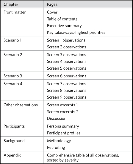
Here’s a good table of contents for a usability report (Table 12.1).
Table 12.1. A usability report structure should summarize the key takeaways at the beginning of the document and then organize the observations around the scenarios of the test.
Two other ways to organize the observations’ chapters:
Organizing by scenario and task
The example goes screen-by-screen, showing results for each screen involved in a particular scenario. The author could instead dedicate each page in the report to a task within the scenario. For example, here’s one scenario for a usability test on an e-commerce site:
It’s holiday time. You’ve loaded your cart with goodies for the family, and you want to send them directly to the recipients. You have stuff to send to yourself, and stuff you want to send to two other addresses.
This might involve several tasks:
• Designate items to send elsewhere.
• Choose a destination address.
• Add a new destination address.
• Configure gift wrap options.
• Select shipping options.
All these may happen on one single screen or across several different screens, depending on the design. The usability report can dedicate a page to each of these tasks. This helps put the observation in context and avoids cluttering observations on a single screen, especially if those observations relate to different kinds of tasks.
Organizing by theme
In analyzing the observations, you might identify certain emergent themes. Here are some themes that came out of a recent usability study:
• Users don’t know what to do next.
• Users didn’t understand jargon.
• Users didn’t understand visual conventions.
• Users missed important content.
You might have dozens of observations that support each of these themes. Categorizing observations in this way can help provide an overview of the results, the bottom line summary of the test. On the other hand, it can be difficult to act on these themes if they all come from different scenarios and reflect different severity levels.
Observations and Severity
An observation is a single discrete behavior exhibited by a participant during a scenario of a usability test. User moves mouse around the screen looking for the submit button. User misses additional information because he or she didn’t scroll. User indicates he or she has no idea what the shipping charges will be. All of these are observations.
When reporting observations, there are a couple things to think about:
• Consolidation: If we reported every specific observation, usability reports would be difficult to read. In practice, reports take liberty with the definition of an observation, frequently consolidating them when more than one user (a) exhibited the same behavior or (b) exhibited such similar behaviors in the same scenario as to yield the same result.
• Design context: The example observations in the first paragraph are all pretty straightforward, but even so could do with a visual context. Attaching an observation to a specific design element helps readers clearly interpret the observation.
There are a few ways to format observations, much in the same way as there are a few ways to annotate wireframes (Figure 12.2).
Figure 12.2. Capturing observations.

Some considerations for each approach:
• Callouts: The most effective approach for showing lots of observations on one screen is to annotate the screen. Though this separates the data (the observation) from the target (the design element) it doesn’t obscure too much of the context.
• Overlays: With a short and sweet observation, overlays create the most direct connection between it and the design element. On the other hand, overlays can obscure the screen and therefore the context. Too many observations on a single screen, of course, and the overlays will obscure the screen completely.
• Excerpts: Removing the design element from the screen gets readers to focus on the specific area and places the observation(s) directly adjacent to it. This is ideal if one area of the screen comprised most of the observations. On the other hand, outside of the entire screen, an excerpt loses some context, and it may be difficult for readers to understand where it fits in.
Summarizing observations in a table
Frankly, your usability report may be ideally represented by a simple but well-designed list of observations. A good spreadsheet can capture the essential elements and drive next steps much more efficiently. A good project team generally needs nothing more than a spreadsheet of to-dos sorted by severity to jump into action.
Tables don’t require a specific level of abstraction. That is, you can incorporate all kinds of observations in a table, especially in a sortable spreadsheet. You can make sweeping statements about the labeling throughout the experience, or you can identify the label on a particular button.
If you can’t have a stand-alone table, you can still include one as an appendix in your report. The table should include at least all the key pieces of information discussed in this chapter:
• The observation
• The severity of the observation
• Design context
A note about design context: While pictures speak louder than words, screen grabs embedded in a spreadsheet look kind of tacky. Therefore, for tables to be successful, teams need a consistent way of referring to aspects of the design. The first few columns of the table should clearly locate the observation (Table 12.2).
Table 12.2. Summarizing usability results in a table must include an elegant way of addressing or locating the observations. This example shows the first five columns of the table, short of the observation itself, just to locate the observation.

Severity
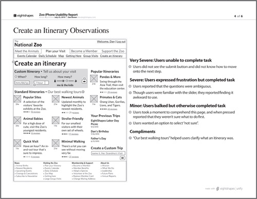
An important data point you should attach to every observation is severity. Books on usability testing methodology can provide a better description of how to measure and assign severity. Suffice it to say that I generally use a scale related to whether users were able to complete a task (Table 12.3). Position severity adjacent to the observation.
Table 12.3. Measuring severity in usability observations usually comes down to users’ ability to complete a task. Severity might also incorporate the number of users who faced the problem. Your severity scale will vary depending on the technique you used in your study.

Figure 12.3. Use icons to show severity.
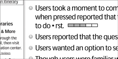
Figure 12.4. Show severity by categorizing the observations.
Further embellishments
Here are a couple other ways you can embellish reporting observations. Remember that the observation itself and severity are most important. Use these embellishments to provide further context or clarity. If they obscure the results, leave them out.
• Category: As indicated in the Organizing a Usability Report section, results are typically categorized by the scenario to which they belong. Other categories describe what part of the site or what kind of task is involved: navigation, browsing, search, checkout. You can attach a simple label on the observation to show category. Icons or other visual devices may distract from the purpose.
• Sensitizing quote: No doubt more powerful than another layer of categorization, direct quotes from participants can further clarify the observation and lend some credence to it. Consolidating observations opens the risk of misinterpretation: Readers may wonder how much license you took in summarizing what you saw. Quotes support observations by eliminating the interpretation.
Summary and Analysis
Perhaps the most important page in the usability report is the summary. Usability reports can seem overwhelming—packed with lots of data and rife with brutally candid feedback. A good summary page not only helps people focus on the most important findings, but it also sets the tone of the report.
Summaries should surface the main takeaways from the study, indicating the site’s primary strengths and weaknesses, and giving the project team a sense of priority. The summary may have explicit next steps, but they also may be implied based on the characterization of the findings. Clearly articulated findings with unambiguous priorities may be all the next steps you need (Figure 12.5).
Figure 12.5. Summarizing usability results entails escalating key findings and providing a snapshot of what you did.
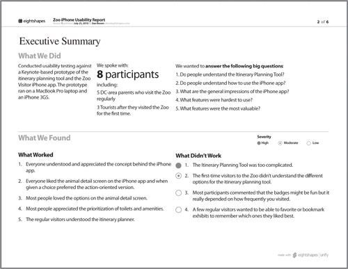
Successful summaries visually describe the mechanics of the test. Avatars representing user groups along with a numbered list of relevant scenarios may be all you need to describe how the test worked.
Analysis
Any time you attempt to interpret your observations to surface a pattern, theme, or motivation, you are analyzing the results. Analysis provides a unified explanation of the findings.
Incorporating such discussion into the document depends on the content. Table 12.4 identifies the different forms analysis can take, and offers ideas on how to include it in the structure of the document.
Table 12.4. Forms that analysis can take.

Recommendations
Beyond analysis, another way to interpret results is to offer some recommendations. To state the obvious, you can suggest how to improve the site based on the data you gathered through the study.
You could narrate a recommendation:
Instead of a set of blue buttons for the controls, consider using a single button for the main action and links for secondary actions.
But this is a book about using pictures to help with the design process, so the natural conclusion is creating a mock-up of the suggested approach. There are, of course, several ways to do this. Figure 12.6 shows one approach.
Figure 12.6. Incorporating recommendations into a usability report using overlays.
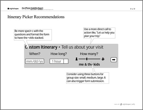
In layering in recommendations, don’t lose sight of the purpose of the document. It can be easy to get carried away with recommendations, but if they obscure the findings, you should leave them out altogether or include a chapter at the end of the document.
Saving recommendations for the end
Note that the table of contents in Table 12.1 doesn’t include a chapter on recommendations. Basic reports probably don’t need them; that’s the role of the design team (see the upcoming Aside). With just a handful of recommendations, the approach just described will likely work just fine. When you’re on the hook to provide a series of recommendations across the whole experience, trying to stuff them on the same pages as the findings can be challenging.
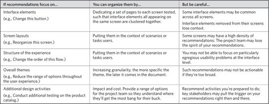
There are several ways to organize the recommendations chapter, and your choice depends on the kinds of recommendations, elaborated in Table 12.5.
Table 12.5. Different recommendations call for different organization schemes in the document.
One last note on recommendations: In my experience, the most effective recommendations are expressed as themes (“revisit labeling”) with supporting examples (“abbreviated field label ‘Med Vert’ caused confusion”). Give each theme its own page in the recommendations section and then show before and after pictures for two or three different prime examples.
Supporting Content
You might be surprised to find methodology under “supporting content.” Presumably, usability reports need to describe what you did, right? Ultimately, the reason to deprioritize the methodology and other mechanics of the study is that they don’t directly help the design effort. Actionability of results does not depend on knowing the method. The document is inaccessible if readers struggle to separate the wheat from the chaff.
Methodology
Summarizing the methodology of a usability test study requires these six points of data:
• The technique (for example, a moderated remote study)
• The number of participants
• The types of users represented by the participants (referencing personas, for example)
• The materials used in the study (a web site or prototype)
• Scope of the study (which part of the experience)
• A quantification of the study scale (number of scenarios)
When elaborating on the study’s methodology, you could also capture the high points of the study’s script. At the very least, you can list the scenarios or tasks users were asked to perform.
To boil down the methodology further, for including in the executive summary, I’ve also chosen three or four (at most!) of the points in the previous list. This makes for a very compact display appropriate for an early page of the document.
Incorporating such a summary may not be necessary if your project team is generally aware that the study is happening and the technique you’re using. Stakeholders that aren’t heavily involved or are unfamiliar with usability testing may benefit from the summary, especially as the document gets passed around.
Participant profiles and recruiting
Team members who weren’t involved in the study are most likely to ask, “Who did you talk to?” They’re more interested in who than they are in what. The motivations for asking are generally methodological:
• You didn’t talk to enough people
• You didn’t talk to the right people
• You missed people of a particular type
My reports sometimes include a separate page describing the participants to address these concerns at the outset. At the very least, such a page gives us something to speak to when we discuss these concerns.
The table-based approach to describing users lists out each participant and some key attributes. This is a good way of showing that you incorporated an appropriate variety of users.
Figure 12.7. Summarizing the methodology in a very compact display makes a useful element on the first page of the report.
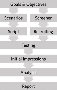
Figure 12.8. A table summarizing participants can highlight the criteria you used to recruit them, addressing concerns about talking to the “right” people.
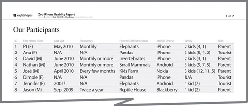
Figure 12.9. Avatars representing participants can build on earlier segmentation analysis. Use avatars that directly relate to that previous work, incorporating the same iconography or color scheme.
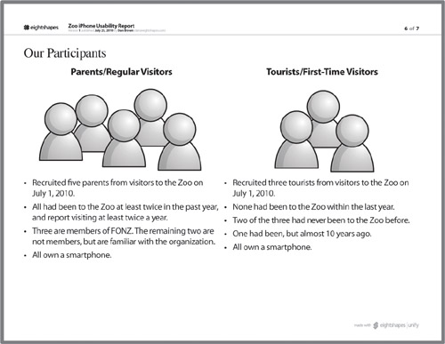
If you already have user segments or personas from work earlier in the project, you can use a cartoon-based approach. The cartoon-based approach shows groups of participants based on the preexisting segments. You can accompany these groups with bullet lists describing the key attributes you sought in recruiting participants from this group.
Getting Inside Their Heads
The conclusion of the last chapter implied that usability testing will live forever, in some form. Far be it from me to change my mind in the space of a chapter, but it’s important to consider what form it will take.
Done correctly, usability testing is a great way to see whether a web site works, but it has some serious methodological concerns to overcome. Placing users in an artificial environment—outside the very place they’ll use the site, sitting next to someone they’ll never see again, responding to questions no one has ever asked them before—means that usability testing in its current form is a design technique trying to be a science.
Many user experience professionals these days advocate getting out of the lab, that is, shedding the artificial environment and going to where people actually do use the web. This sounds daunting. If we have a hard enough time finding the time to schedule a couple days of testing and getting a good selection of users to come to the lab, won’t it be more difficult to visit their homes and offices? The answer is most likely “yes,” but the bigger concern isn’t logistical; it is, again, methodological. This kind of testing is not appropriate for every situation.
In fact, the evolution of the web and the web design process points to more immediate access to usability results. More and more web-based services launch so-called “beta” versions of their sites—mostly finished, but far from final. Some sites live in what the industry used to call “perpetual beta.” Like the house up the street whose owners are constantly renovating, these sites are being tweaked daily. Basic assumptions about how the web is built and used shift constantly. (For example, since the first edition of this book, perpetual beta has fallen out of favor. Now, some designers just assume that the “final” version of a site is one that’s constantly evolving. Still other teams can’t escape the idea that a launched web site must be complete in every way.)
Early adopters of this methodological shift are probably not doing usability testing the way you and I are doing it. They’re probably planning the initial site carefully, putting it out there, soliciting feedback, and issuing new “releases” every quarter, every month, every week in response. And now we get back to the point of this chapter: understanding how people use a web site. When you do a usability test, sitting with actual users, you get a rich array of data. The people who are building perpetual beta sites don’t have access to that same depth of information. The next stage of usability testing needs to be a convergence of these two ideas: rich data with near-real-time response.
Like any deliverable, usability reports will need to adapt to pace the evolution of technique and method. Yet the essential content—observations, design context, and severity—will remain the same. It’s these elements that trigger a response from the design team and help define what that response should be.
Exercise
Developing a good usability report depends on having good content. I would not recommend outlining an abstract usability report: You won’t know if it makes sense or not. One good source for “usability” data is product reviews. What’s great about product reviews is that they usually don’t have recommendations: Reviewers aren’t on the hook for making the product better, just telling you what’s wrong with it.
Next time you’re in the market for something (a baby stroller, for example, or a digital camera or a home theater projector or an espresso maker), find a few different product reviews online and translate the review into a collection of observations. You can start with a spreadsheet, entering each relevant quote from the review into a separate row in the table.
Analyze the “observations” to determine if they can be categorized, and if they’re at a particular level of abstraction. (For an espresso maker, a review may focus on the range of features, or it may describe the usability of a particular feature. It will, hopefully, also address the quality of the coffee.) Assign severity levels to the observations. Decide on whether you want to incorporate recommendations.
The number of observations won’t rival the scale of observations you’d get in a usability exercise. (Only one user and limited by the constraints imposed by the original publishing medium.) If you need more fodder, use three or four reviews, acknowledging they may come from different products. (You’re just trying to generate some fake content.) Compose a report from the product review(s), including product images as if you were including screenshots.
If you have a study group, present the report to them. Make sure they wear their “project team” hats, each playing a different role on the team—designers, stakeholders, engineers. Offer to buy the product for the team member who plays their role the best. (Just kidding.)


